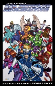
 Like any specialized blog or website TheoFantastique receives a number of review copies of items, including comics. Comic books and graphic novels are an expression of the fantastic in popular culture, and they have been discussed here in the past. But with this post we turn over comic reviews to a new guest columnist, Richard Moore, a comic artist and writer responsible for Far West, and Boneyard, as well as The Pound and Deja Vu. (See the previous interview with Moore for more background.)
Justin Leach’s
MAJESTIC XII
Leach & Kilian
By Richard Moore
For those who’ve been keeping track of the dwindling comics market (yes, I’m speaking to both of you), it’s not pretty out there. No one knows the difficulty of launching a new comic title better than myself, which is why I’m loathe to criticize a new entry into the field. I genuinely wanted to find something worthwhile to recommend in Justin Leach’s MAJESTIC-XII, but unfortunately I was limited to the contents of the book.
MAJESTIC-XII is the story of a team of superheroes charged with fighting a secret war against alien invaders. One has to wonder how these aliens–who already control most of the universe–can possibly be held off by a handful of superhumans, who seem to do nothing but engage in chaotic fist-fights with other superhumans, and moon over each other in constant, maudlin interior monologues. Oh, and did I mention that most of these superheroes(?) are criminals, freshly sprung from prison? See, that makes them a rag-tag group of anti-heroes; it makes ’em edgy.
The writing is awkward at best, from confusing scene jumps to sledgehammer exposition delivered through cliche-ridden dialogue. Consider this charming example, followed by “revealing” inner thoughts, from a superheroine in the midst of a super-powered brawl:
“Eww! That smells like fried zucchini–Ick!” Wow, Legend is soo dreamy!!“
Even the emphasis of particular words within the dialogue is baffling. Emphasis should crystallize dialogue, help it come alive inside the reader’s mind. Here, it creates a verbal obstacle course, tripping-up the reader and requiring multiple readings of the same lines to make sense of them.
All this might at least have been tempered by good (okay, great) artwork, but such is not the case with MJ-XII. Backgrounds are virtually nonexistent, which not only means that no sense of space is created, but at times makes it difficult to tell exactly where things are taking place. Bodies are uniformly massively-muscled, with the only difference between genders being huge breasts on all woman. I realize subtlety is not the point here, but it would be nice if every single character didn’t look like his or her super power were superhuman tolerance of anabolic steroids.
This is only the first issue of MJ XII, and normally I’d allow for the possibility of growth. Unfortunately, about the best that can be hoped for here is that readers will mistake the book’s glaring flaws for camp.


There are no responses yet